Church+State
New brand. New look. Same address.
New brand. New look. Same address.
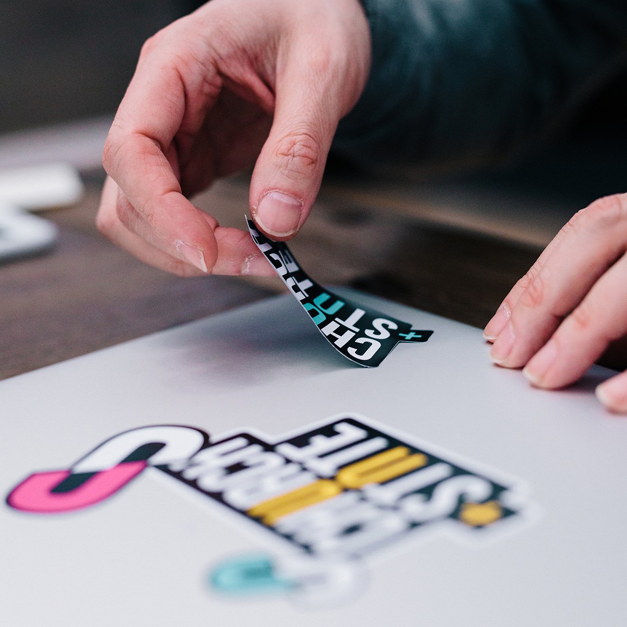
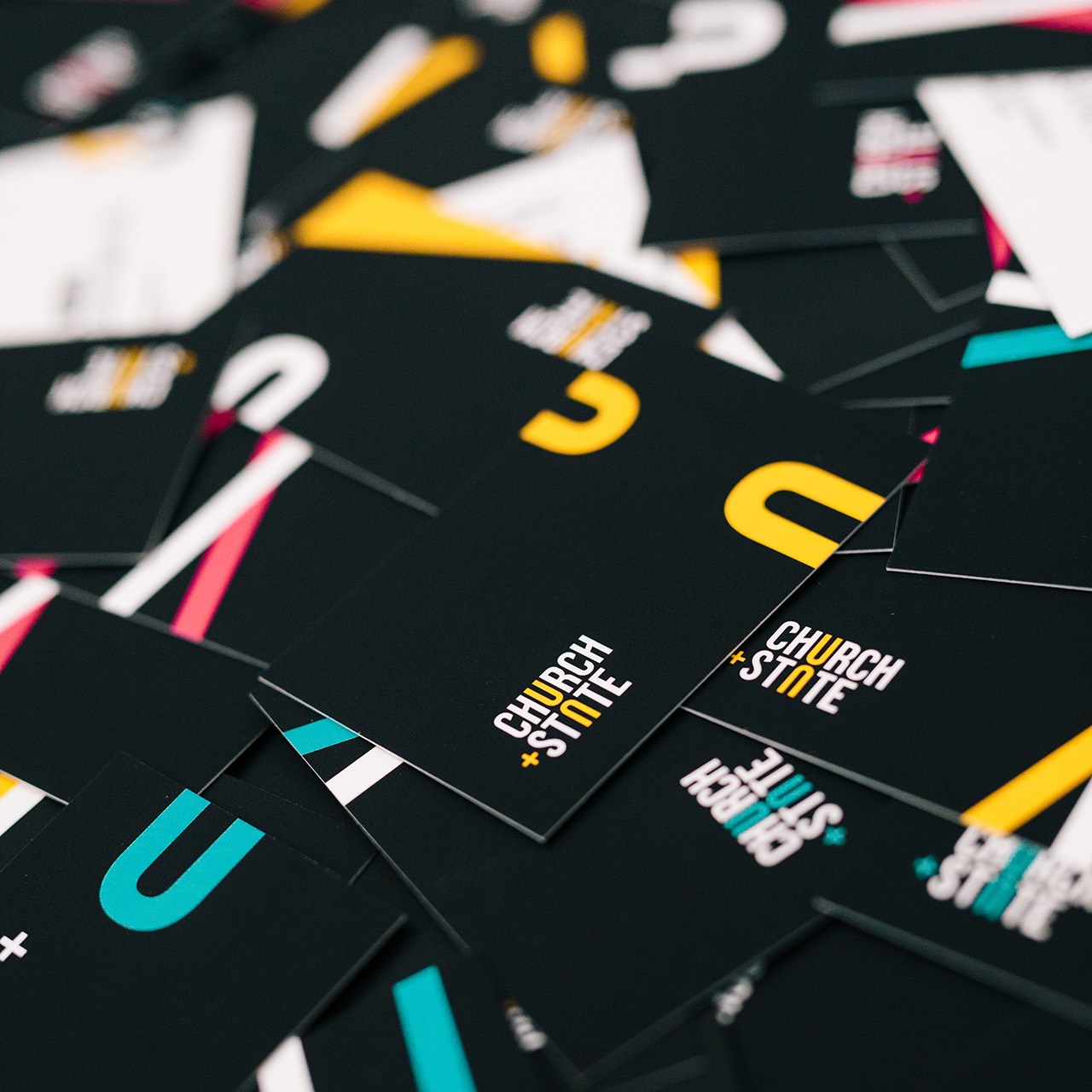
Stuff we did: Branding + Design + Web + Interior Design + Film + Content
Forget 99 problems. We only had one. It went like this: How do we make our brand as bold on the outside as we are on the inside? So we got down to business, doing what we do best.
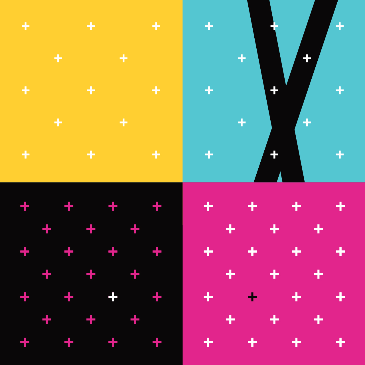
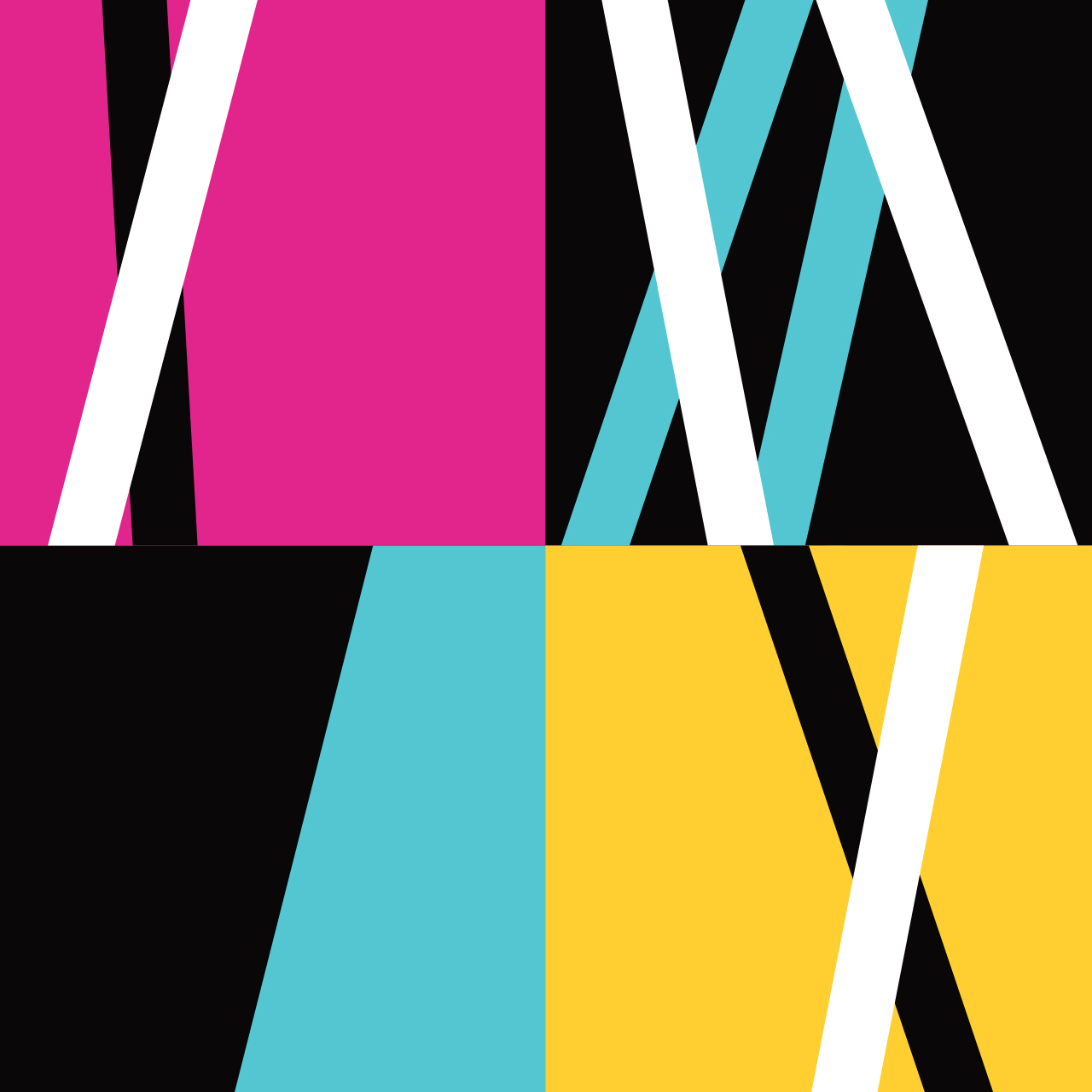
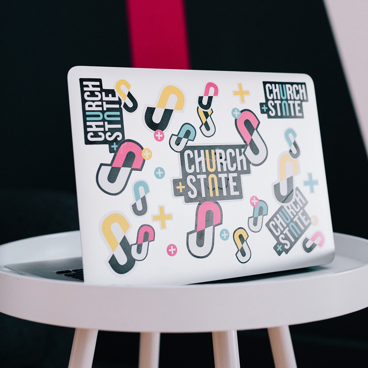
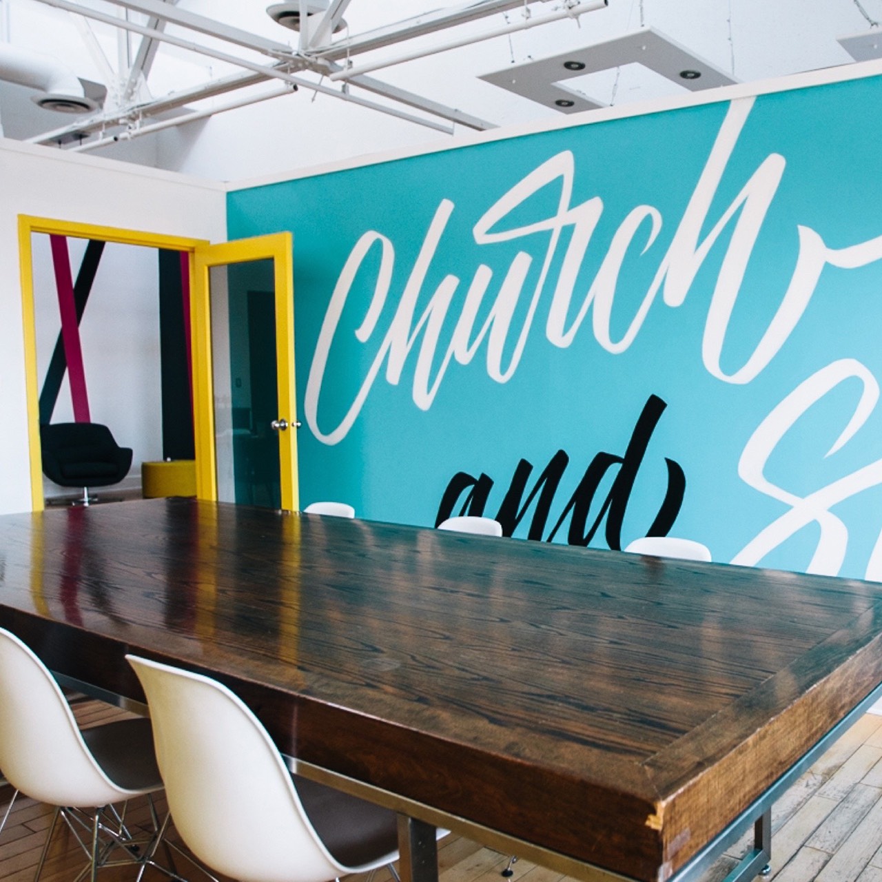
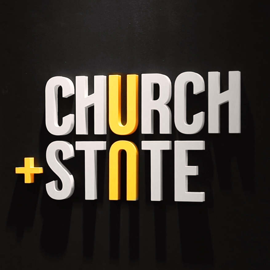
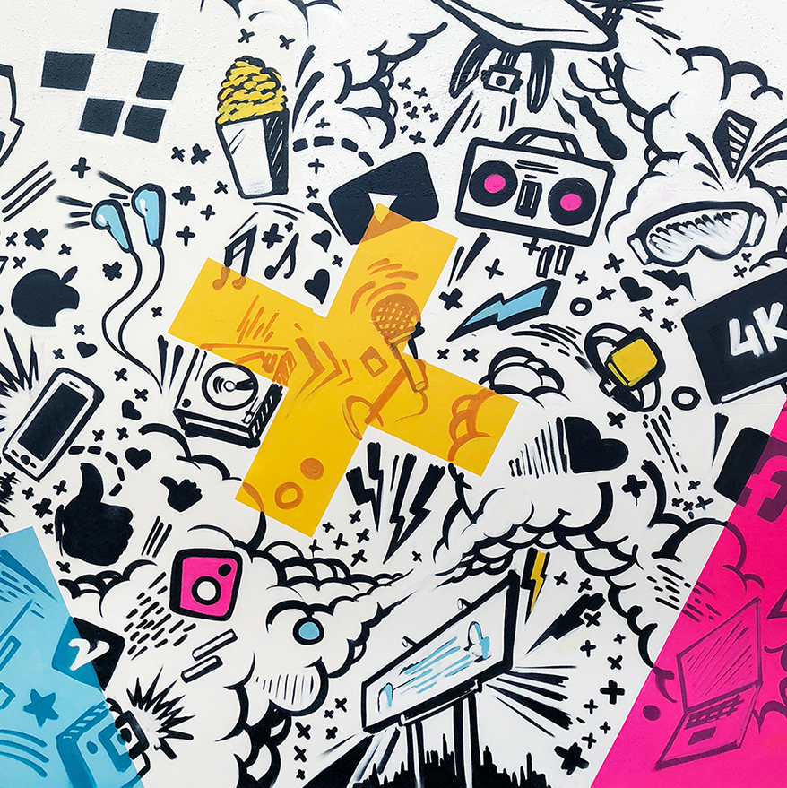
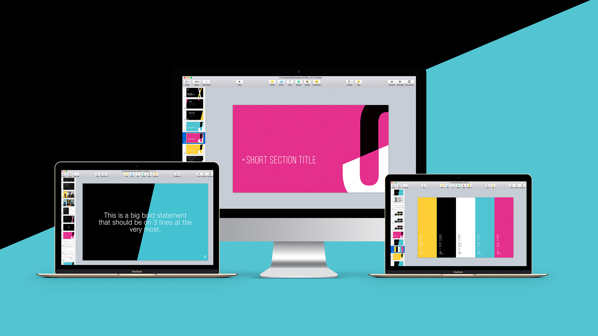
While our old brand was black and white (just like advertising and content used to be), Church+State is anything but. Now everything from our logo, to our design system, to our collaborative workspace is bright, colourful, and inspires creativity.
Church+State represents the work we do and the type of work we want do. It’s fresh, it’s current, and it’s creative… just like us.